The Pantone Color Institute has made its annual announcement, naming the **Cloud Dancer Color** as the Color of the Year 2026. This shade is a soft, billowy white, marking a significant departure from previous bold selections. For the first time since 1999, a white hue like **Cloud Dancer Color** takes center stage. This choice reflects a broader cultural shift, signifying a collective desire for peace and a need for quiet reflection, making **Cloud Dancer Color** a pivotal selection for the year.
A Yearning for Simplicity with Cloud Dancer Color
The world feels overstimulated, and modern life is often a “24/7 hustle culture.” This pace leaves people feeling overcommitted. The “cacophony” surrounding us can be overwhelming, making it harder to hear our inner selves. **Cloud Dancer Color** emerges as a response to this, offering a “breath of fresh air.” It embodies a yearning for a future free from toxicity and signals a move away from excess. This selection taps into a desire for balance and speaks to living in a world that is kind, emphasizing deeply human connections. The **Cloud Dancer Color** is a perfect fit for the 2026 color trends.
The Meaning of Cloud Dancer Color
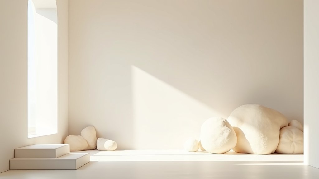
**Cloud Dancer Color** is more than just a white. It acts as a “blank canvas,” inviting a fresh start and representing new beginnings and possibilities. The hue offers a promise of clarity, helps to enhance focus, and provides release from external distractions. The **Cloud Dancer Color** has a natural and human quality, achieved through balanced warm and cool undertones. It is not a stark or sterile white; instead, it possesses a subtle warmth that makes it feel organic. It moves beyond crispness into something more feeling and also conveys inner tranquility, embodying calming colors.
Industry Influence and Trending Styles with Cloud Dancer Color
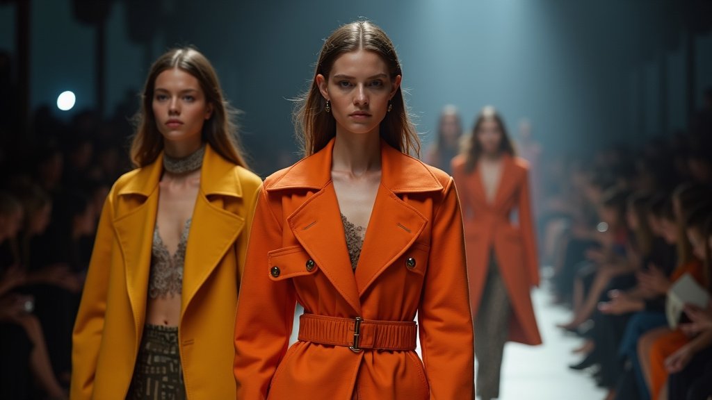
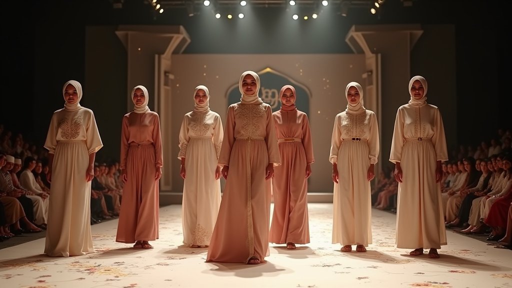
This new **Cloud Dancer Color** will shape many trends, influencing fashion and interior design. **Cloud Dancer Color** encourages relaxation and creativity. It serves as a structural color, supporting pastels and neutrals, and also complements more saturated hues. For interiors, it creates spaciousness and promotes serenity and visual cleanliness, leading to calming, retreat-style spaces. In fashion, it inspires minimalist styles, where clean bases and subtle tonal accents will trend. Elevated minimalism is also a key trend. Fabric finishes like mesh and silk will be popular. Even nostalgic styles might resurface, think Sixties white liner or go-go boots. In beauty, expect soft-white nail looks. Makeup trends will embrace diffused finishes; airy luminosity will also be prominent. Branding and packaging can utilize the clean aesthetic of **Cloud Dancer Color**, supporting luxury or wellness-led designs. The **Cloud Dancer Color** is inherently trending, offering a versatile style for many applications, especially for those seeking interior design color inspiration.
Pantone’s Selection Process for Cloud Dancer Color
Pantone’s Color of the Year is not chosen lightly. Experts at the Pantone Color Institute conduct ongoing research, observing cultural moods and societal shifts. This team of trend forecasters studies influences globally, looking at art, fashion, and technology. Travel and socio-economic conditions also play a role. Leatrice Eiseman, Executive Director, and Laurie Pressman, Vice President, lead this effort. They distill these complex inputs to find one shade capturing the zeitgeist. **Cloud Dancer Color** was chosen after careful consideration, reflecting current global sentiments and representing a collective aspiration, making it a thoughtful Pantone Color of the Year choice.
Embracing Cloud Dancer Color
**Cloud Dancer Color** invites a new way of thinking; it’s a gesture toward contentment and unity. It offers a counterpoint to our frenetic society, championing measured consideration and quiet reflection. The **Cloud Dancer Color** encourages us to pause, allowing us to disconnect from digital noise and opening doors for imagination, fostering innovation and new approaches. For 2026, **Cloud Dancer Color** offers simplicity and provides a serene backdrop for life. It is a subtle statement for a demanding world. This airy hue reminds us to seek balance and highlights the need for human connection. The news of its selection sparks conversation, encouraging a mindful approach to the year ahead, especially for those adopting a minimalist style.

